


Designing a card business for scale
(not just today)
SOFI
FINTECH
STRATEGY
VISION
I led the redesign of SoFi's credit card experience, fixing the trust deficit, restructuring the product for scale, and building the business case that expanded a single card into a family of five. The card business is now on a path to profitability one quarter ahead of target.
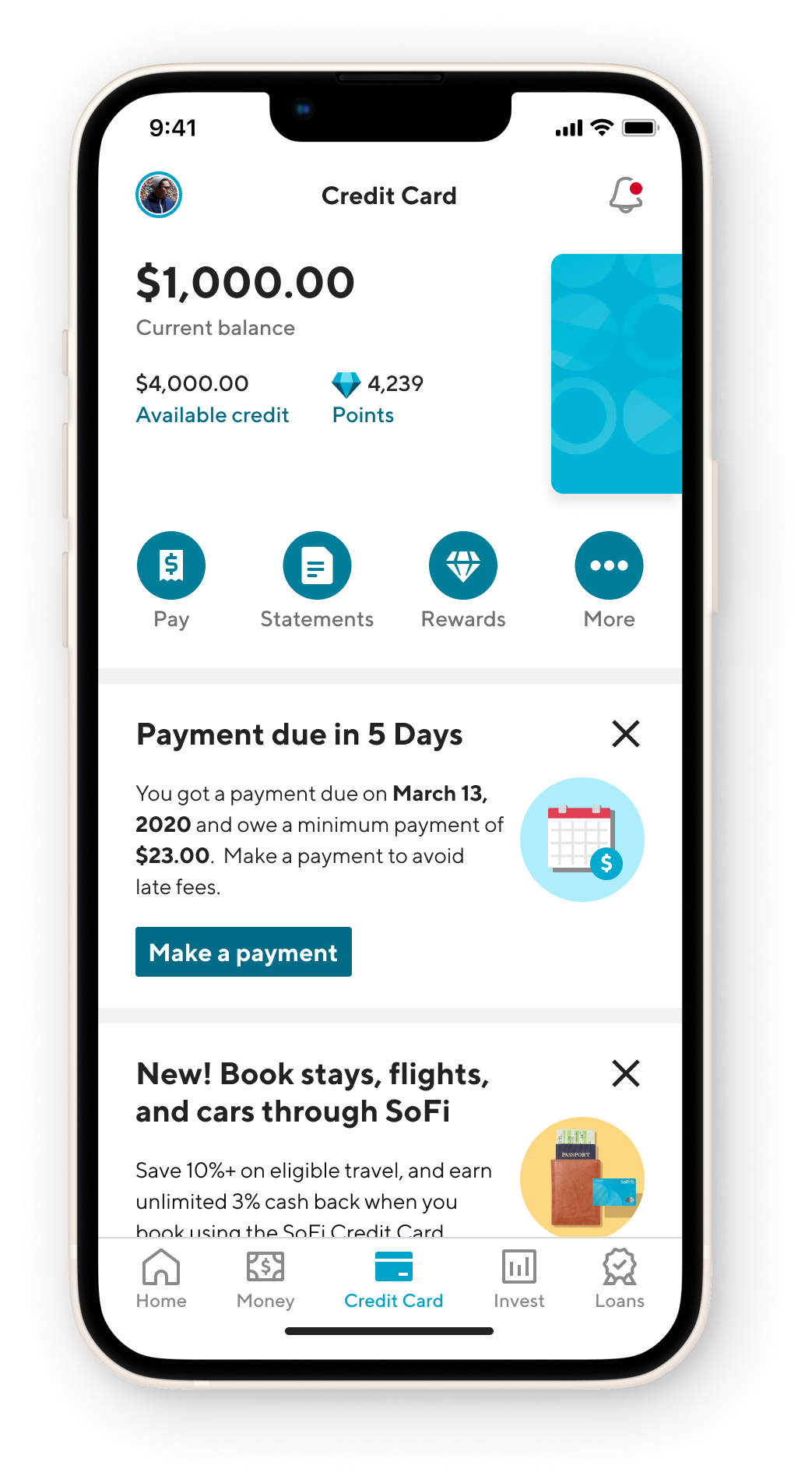
BEFORE
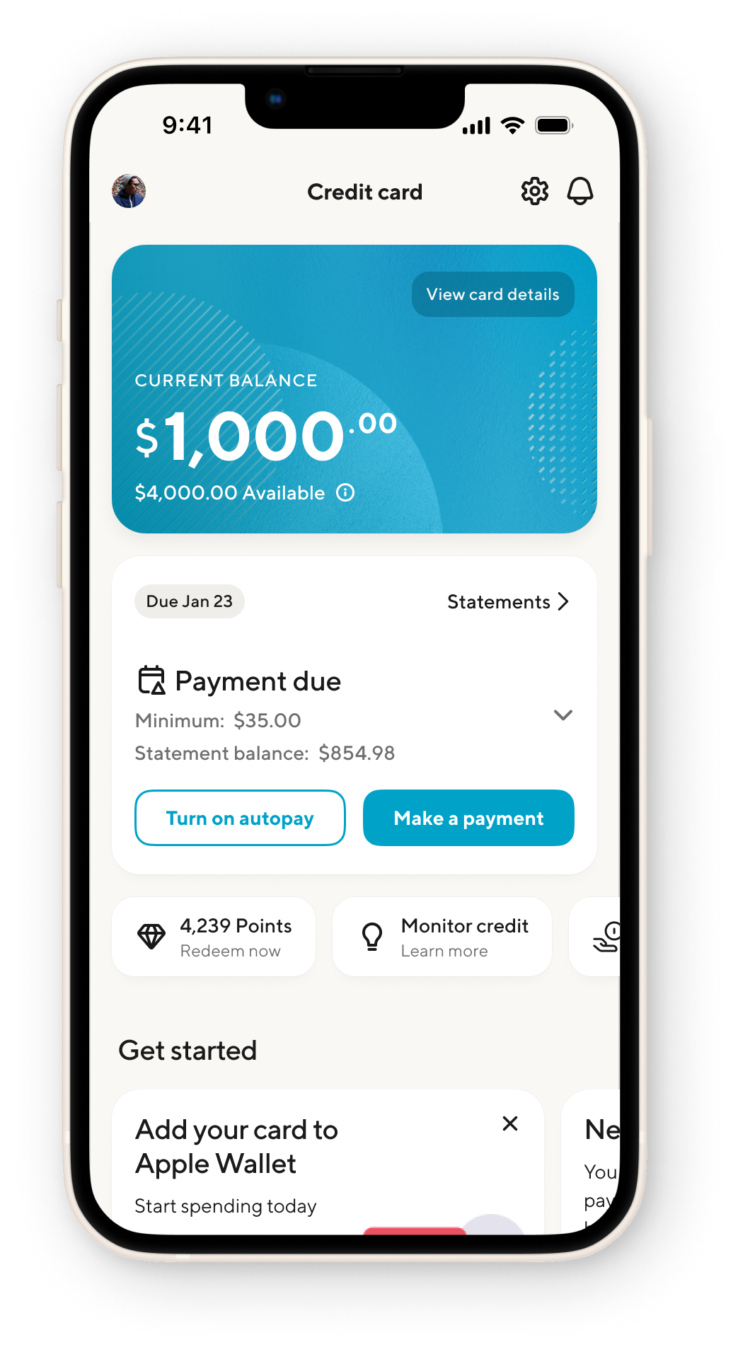
AFTER
ROLE
Senior Manager

TEAM
3 Product designers
1 Content designer
CROSS-FUNCTIONAL PARTNERS
Director of Eng, Product & Research, VP Business, Card Ops, Customer success
Context
Credit cards are consistently a loss leader to start. However, our business was off pace against the industry. We were making incremental background changes to improve our financials, but not at a significant enough pace. We had a number of competing priorities, but lacked the clarity to know what to attack first.
How has the team changed? Design now operates on more sprint cycles with our EPD (engineering, product, design) partners to regularly identify opportunities for future quarters. We’ve adopted a theme of ‘getting ahead’.
Running the team
I structured the team around surface ownership, not function. Each designer owned an end-to-end slice (account summary, payments, and the card expansion work) rather than working in parallel on the same feature. This kept decision-making fast and accountability clear. I made it clear and held people accountable to having a holistic understanding of the entire experience and the impacts decisions may have on others. This was accounted for in detailed crits, decision-making documentation, and clear Figma design organization.
The harder problem was prioritization pressure. Leadership wanted everything at once. My job was to hold the sequencing: we couldn't improve engagement metrics if we hadn't first fixed the trust baseline. I made that case repeatedly to the VP of Business, to Card Ops, to Product, using the research to de-emotionalize the debate.
By the end of the engagement, design was operating on sprint cycles with EPD partners to proactively identify next-quarter opportunities. We weren't reacting anymore. That's the structural shift I was building toward from the start.
Problems
- Our members have been steadily losing trust in the product, evident by the lowest NPS score among SoFi products.
- Complaints have been increasing by 5% on an annual basis, ranking credit card highest among SoFi products.
- Our business economics weren’t meeting target thresholds due to targeting the wrong customers.
- Our core user experience had misaligned and poor communication, coupled with inefficient workflows.
Strategy
Our information architecture needed to have a member first mentality. Doing right by the member often yields the best business results (spoiler: it did).
Based on member research (card sorting, jobs to be done), we gathered evidence to our hypothesis that our members needed less, not more.
- Referrals: weren’t monetizing
- Payments: missed due to poor UX
- Rewards: rarely used
- Ads/Crossbuy: overbearing
We balanced business priorities with elevated, but temporary promotions, along with education and features that have financial impact and member benefits.

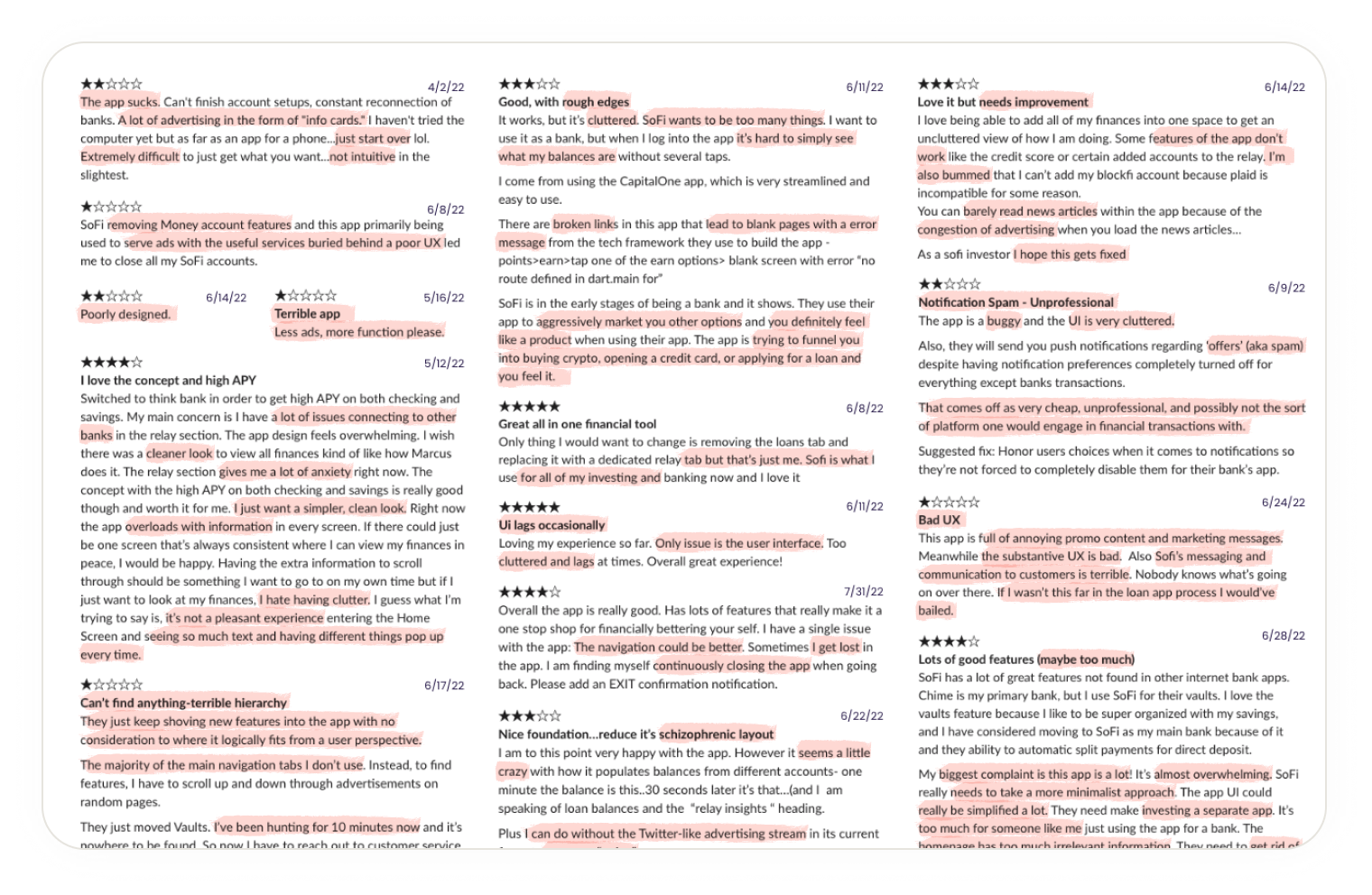
“Less ads, more function please.”
~ Reddit user, 2022
Alerts
Dismissible
Account summary
Balance, more credit details, card infomation
Payment widget
All states and actions
Rewards
Credit score
Benefits
Activation/Promotion
Dismissible and temporary space to promote actions
Transactions
Recent transactions w/ search
Education & features
Learning, upsell, crossbuy
Alerts
Dismissible
Account summary
Balance, credit, rewards
Actions
Pay, statements, rewards, menu
Referrals
Advertisements
Dismissible
Payment widget
Dismissible
Transactions
Recent transactions w/ search


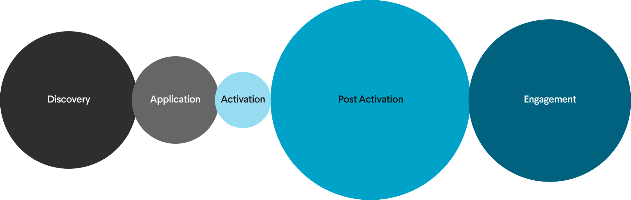
A shift in focus
The whole team had to shift their lens from thinking about the back book and application conversion (still important) to activation, post activation, engagement, and the core experience.
In addition, Research gave us a clear signal: members weren't failing at the edges of the product. They were failing at the center, the two moments that happen every single month. Account summary was the first thing every member saw. Payments was the thing they had to get right or it cost them money.
We had limited runway and competing priorities. So we made a call: attack the highest-combined-impact surface first. Account summary and the payment widget drove the most member complaints, the most support contacts, and critically, the most missed payments. Fix those two, and we'd move the financial metrics and trust signals simultaneously.
Everything else (rewards, referrals, education) was sequenced after. Not ignored. Sequenced.
Strategically target company OKRs
We were having problems prioritizing this work - lack of conviction, resources, changes in leadership. I spent a lot of time mapping leadership and business priorities to the impact this work would have on their goals.
Seek to understand. Make the connection. And find the through line.
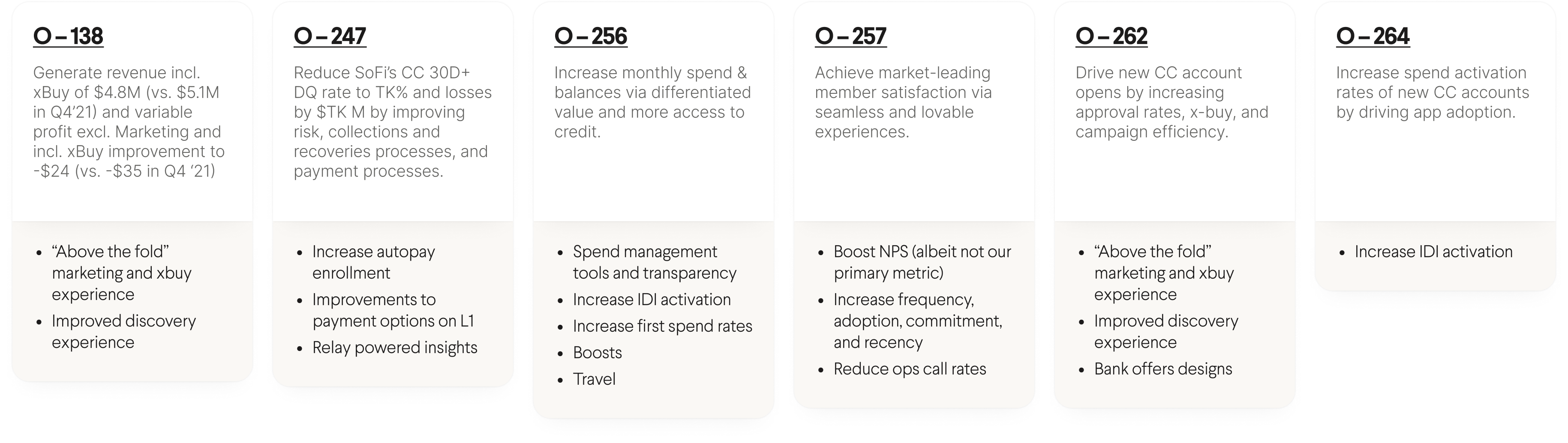
Planning to ship
To get alignment for the work, I partnered closely with engineering to develop a realistic roadmap. In addition, we created a set of phases and priorities. This roadmap gave us the ammunition to get internal buy-in, solidify the roadmap, and approve additional headcount.
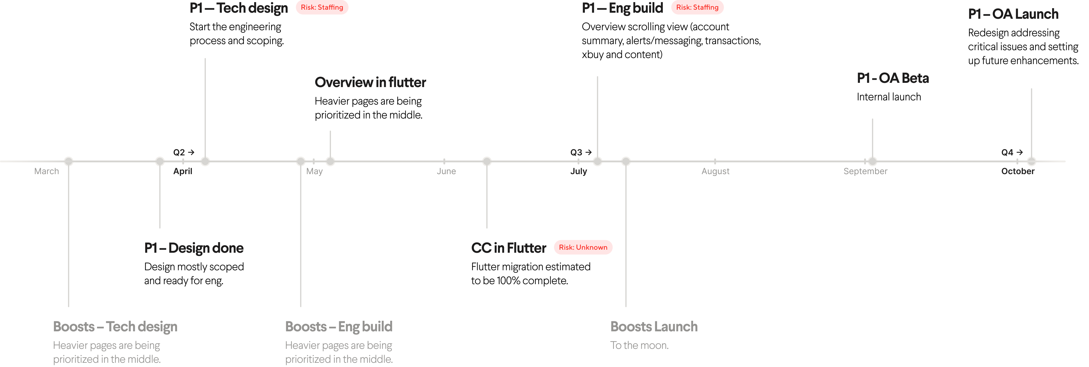
Execution
75% of the design work, iteration, user research, and testing involved two widgets: account summary and payments.
Accounts, Balances, and Transactions
The top of the page is critical to setting up any experience. The paradox of choice and cognitive load theory played a big role in why the original design was unsuccessful. It wanted to do everything, give the member everything, but in return it yielded much less than hoped for.
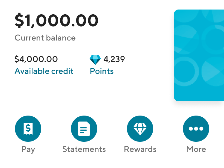
BEFORE
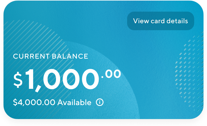
AFTER
User research & decisions
We quickly identified some improvements. We removed the actions - pay lacked context, statements and rewards were used less than 5% of the time. Rewards and points were duplicate features. The more button was also in the navigation bar (settings). There was no interaction with the card design.
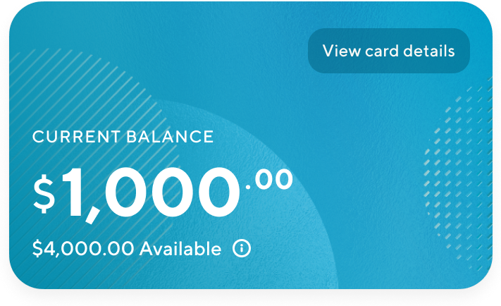
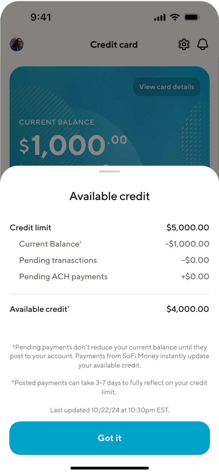
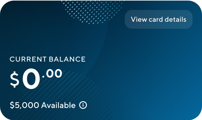
I highlight the current balance. I provided deeper understanding into how balances are calculated. And we brought card details to be a simple click away.
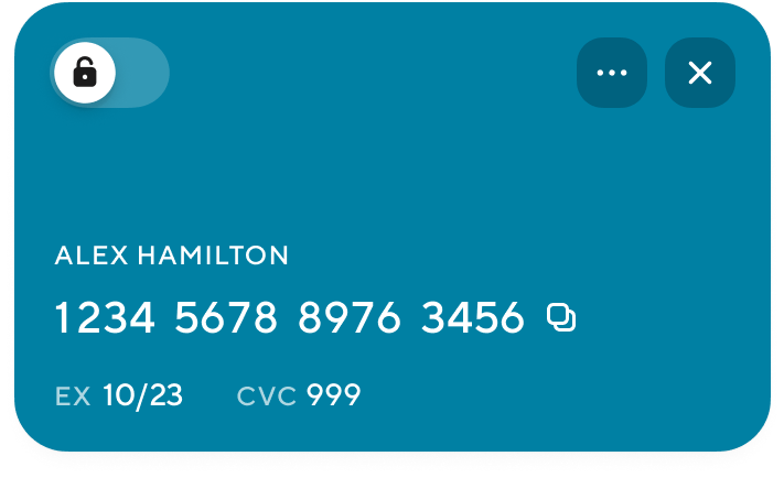

Quick lock/unlock

Copy card details to clipboad
Manage card

Opens bottom sheet balance details

Easy access flip for card details

Credit limit calculations
Detailed explanations of transaction timing
Pending transactions add
up to the available credit
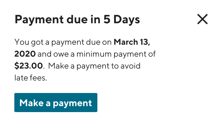
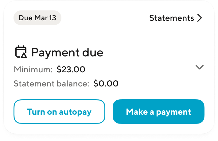
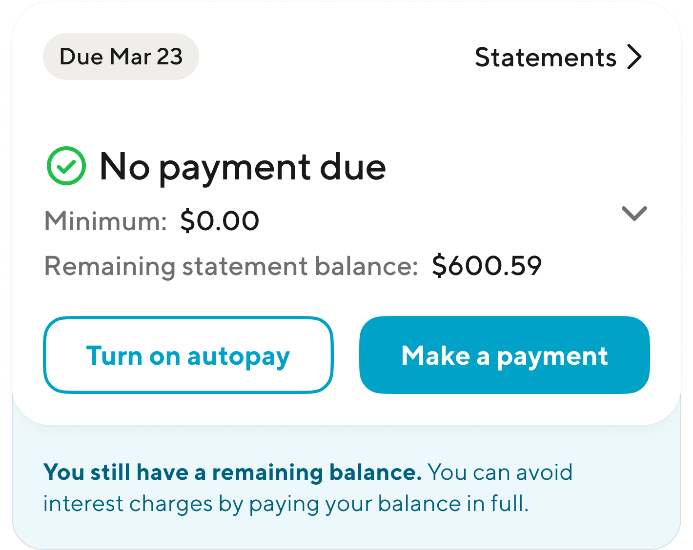
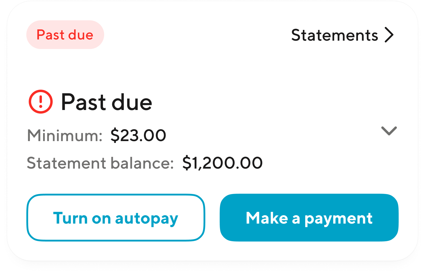
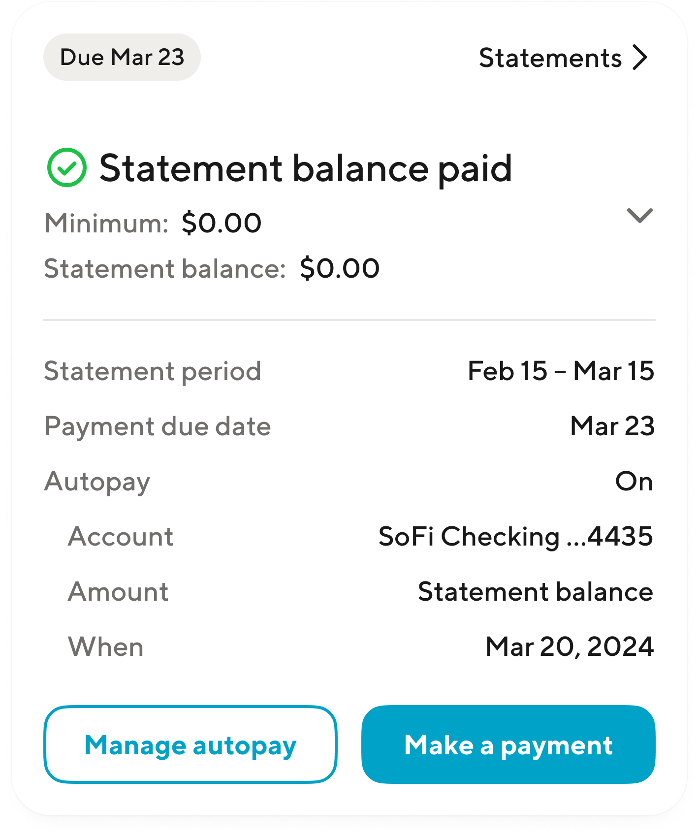
Payment Widget
The payment journey is a month long process. It’s complicated at times, but very predictable once understood. I established a few key principles and goals to create the foundation for our design decisions from a member and business perspective:
- Tell the user what they need to know, not what we want to tell them
- Consistency
- Scan & Scalability
- Improve autopay conversion
- Payment confidence (autopay and manual)
BEFORE
AFTER
User research & decisions
The toughest challenge with this widget was balancing when autopay is on versus off. Status and details differ.
- The chip consistently displays due date, unless past due
- The primary line should always reflect your payment status
Impact & Outcomes
As a result of my work, the company approved a strategic vision to expand the credit card products and redesign the experience, fixing our cohorts and demographics, and building a family of cards. The credit card business is now on a path to profitability one quarter earlier (October 2026).
In addition, this led to breakthroughs in a new product line: secured credit cards, where I launched the Smart Card.
25% REDUCED CALL VOLUME
$6+
Million annually
Many small improvements led to a significant reduction in call volume, directly reflected as cost reduction.
IMPROVED USAGE & POSITIONING

44%
of people think SoFi beats competing cards

60%
of members put their SoFi card as top of wallet

21%
of members want a second card from SoFi
FAST TRACK TO PROFIBILITY
$75M
ANNUALIZED SAVINGS
- Operation efficiencies
- App & onboarding improvements
- Improved targeting
- New user experience
- Cross buy into personal loans and other SoFi products
- Updated communications about balance transfer & payments
22% NPS UPLIFT
44
from 36
The launch of the landing page redesign with the new design system exceeded similar product updates.
Let’s get to work
I'm always interested in connecting with fellow leaders, exploring new opportunities, and discussing, well, just about anything.

Get in touch

Michael Spiegel
© 2026 Two Pixels, LLC. All rights reserved.
Home
Work
About
Substack

Home
Work
About
Blog

Get in touch