Traceable AI
Traceable was founded to solve one of enterprise security's hardest problems: APIs were multiplying faster than anyone could monitor them, and attackers knew it before most security teams did. I joined in May 2019 as the first design hire, with no team, no brand, and no system.
Over three years, I built the design function from scratch — brand identity, product design, marketing system, and agency partnerships — and we closed a $60M Series B in May 2022.
ROLE
Design Director
Partner management

TEAM
Founding partners
2 Product designers
1 Agency
CROSS-FUNCTIONAL PARTNERS
CEO, CTO, Head of Engineering, Product, and Marketing


Session Activity


POST /cart
POST / checkout
POST /itup
POST /itup
POST /logout
/product{id1}
GET /product
POST /login


Behavior model


The Founding Context
By 2019, APIs had become the dominant attack surface in enterprise software, and the security industry hadn't caught up. Most tools were built for perimeter defense, not for the kind of distributed, cloud-native traffic that modern applications ran on. Traceable's founders, Jyoti Bansal and Sanjay Nagaraj, had seen this gap up close at their previous company and built Traceable specifically to close it.
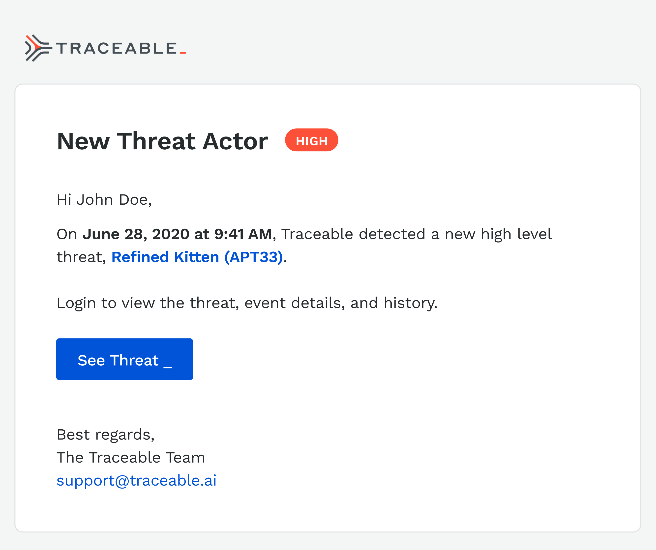
The product thesis was sound. The design problem was credibility. Enterprise security buyers, specifically CISOs, are among the most skeptical audiences in technology. They’re accustomed to tools designed by engineers for engineers or ones that simply bypass any type of UI, such as terminal or CLI. This was a common refrain at previous companies such as D2IQ and CircleCI, so I was close to these conversations. They buy on trust, validated by proof. A company with no visual identity, no coherent web presence, and no polished product UI was going to lose deals before the demo started. Design was a sales prerequisite with validation of the efficacy of the tool. Over time, a core group of us were able to demonstrate the product both through monitoring and finding vulnerabilities in their system.
The website came third, because it was a part of our stealth launch and only shared with potential clients internally.. The product design work continued to run in parallel as the engineering team matured, and the marketing system was built to scale content without requiring a bigger team to produce it.
By the time we were closing our Series B and before I left, we had two additional product designers, one agency relationship, and a design system that covered brand, product, and marketing. That output came from three years of deliberate sequencing, creating the business case for more headcount as our product grew.
2019
Apr
Jul
Oct
2020
Apr
Jul
Oct
2021
Apr
Jul
Oct
2022
Signed July 14, 2020
2 Designers
Signed May, 2022
Stealth launch
2.0 Designs
MVP
1.0 Launch
Branding & Identity
Website
Series A
Hiring
Series B
July 14, 2020
July 14, 2020
June 2019
Apr 2020
Jan 2020
July 2020


Planning to ship
To get alignment for the work, I partnered closely with engineering to develop a realistic roadmap. In addition, we created a set of phases and priorities. This roadmap gave us the ammunition to get internal buy-in, solidify the roadmap, and approve additional headcount.
Building the Function
When I joined, the design function was a blank slate. No system, no brand, no process. The question wasn't what to design first. It was what the business needed most to operate credibly in the market.
I sequenced it with a strong design POV, but in collaboration with the CEO and CTO. Initial designs for the core of the product came first. We needed to resolve some foundational issues such as the trace flow, information architecture, and prioritized details. While brand identity was developed in parallel, it was secondary in sequence because the visual language served as the foundation for everything downstream—including the product UI, website, and sales collateral. I prioritized understanding our strategic direction before diving too deep into the UI. Consequently, I architected the entire design system to anticipate these shifts, ensuring a seamless and efficient transition.
The website came third, because it was a part of our stealth launch and only shared with potential clients internally.. The product design work continued to run in parallel as the engineering team matured, and the marketing system was built to scale content without requiring a bigger team to produce it.
By the time we were closing our Series B and before I left, we had two additional product designers, one agency relationship, and a design system that covered brand, product, and marketing. That output came from three years of deliberate sequencing, creating the business case for more headcount as our product grew.
I wrote the creative brief, then ran a competitive pitch process with the CEO and CTO to select the right agency. The brief wasn't about aesthetics. It was about the buyer. Who are we talking to, what do they already believe, and what do we need them to feel in the first ten seconds of contact with this brand. The agency selection came down to which team understood that question most clearly, not which one had the best portfolio.
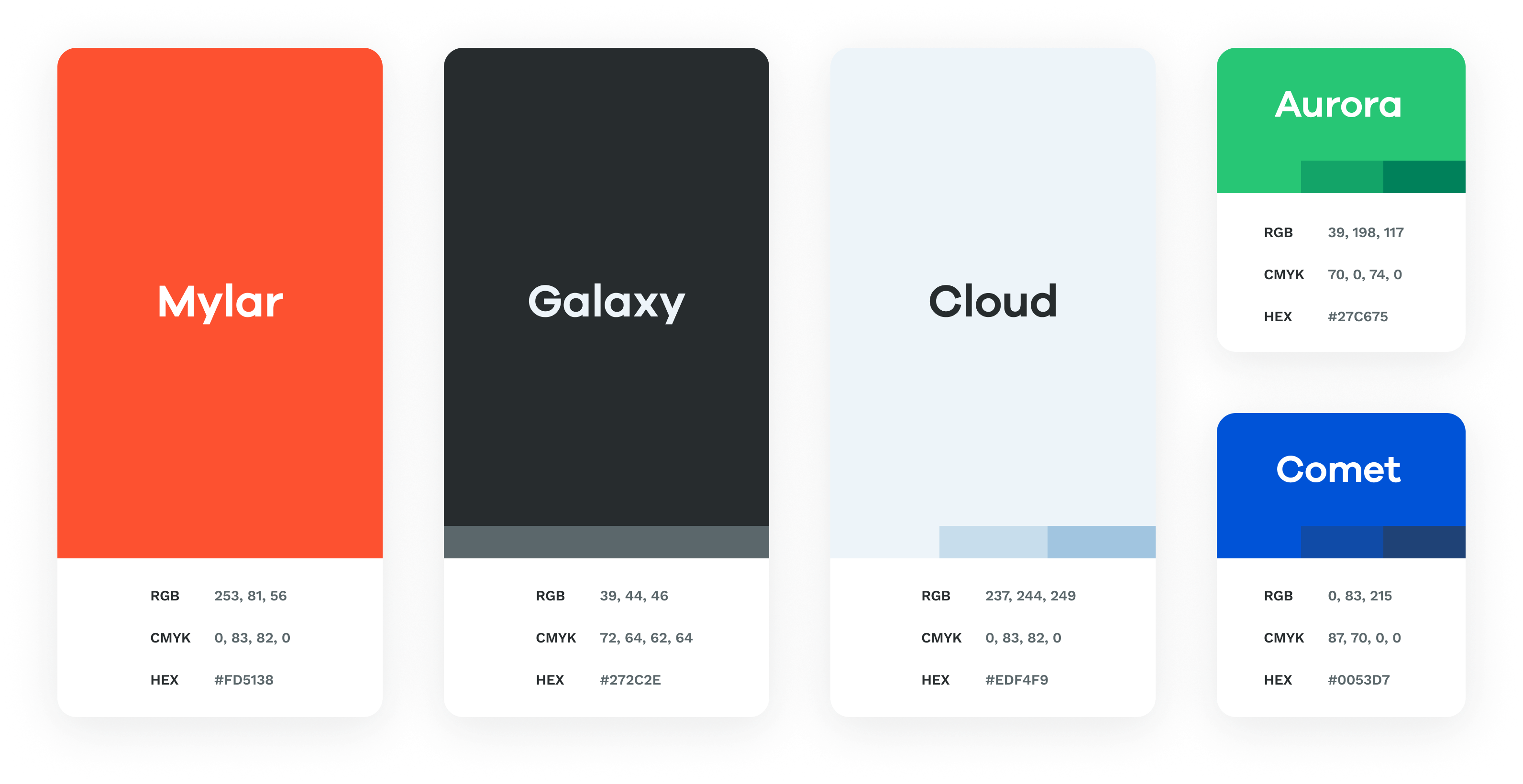
What came out of the process was a visual identity built on clarity and precision. Clean type, a restrained color system, and a mark that worked at every scale from a favicon to a conference backdrop. The design intentionally avoided anything that read as aggressive or theatrical. In a category where fear was the default sales motion, we chose confidence instead.


Brand & Identity
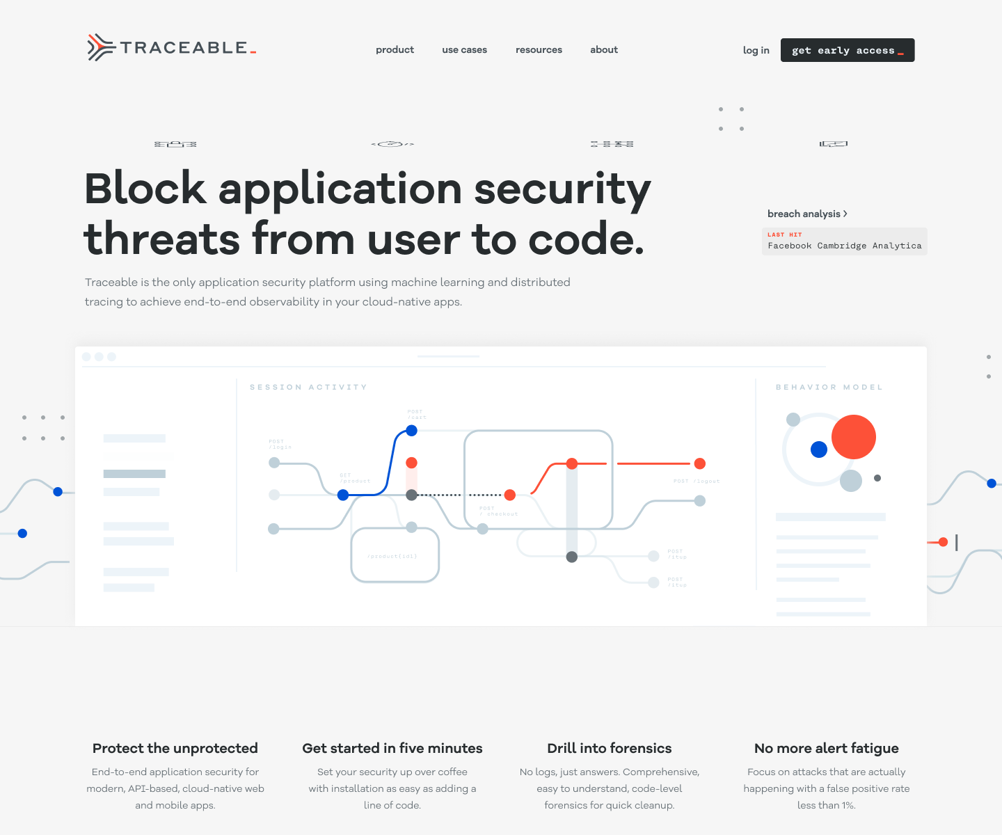
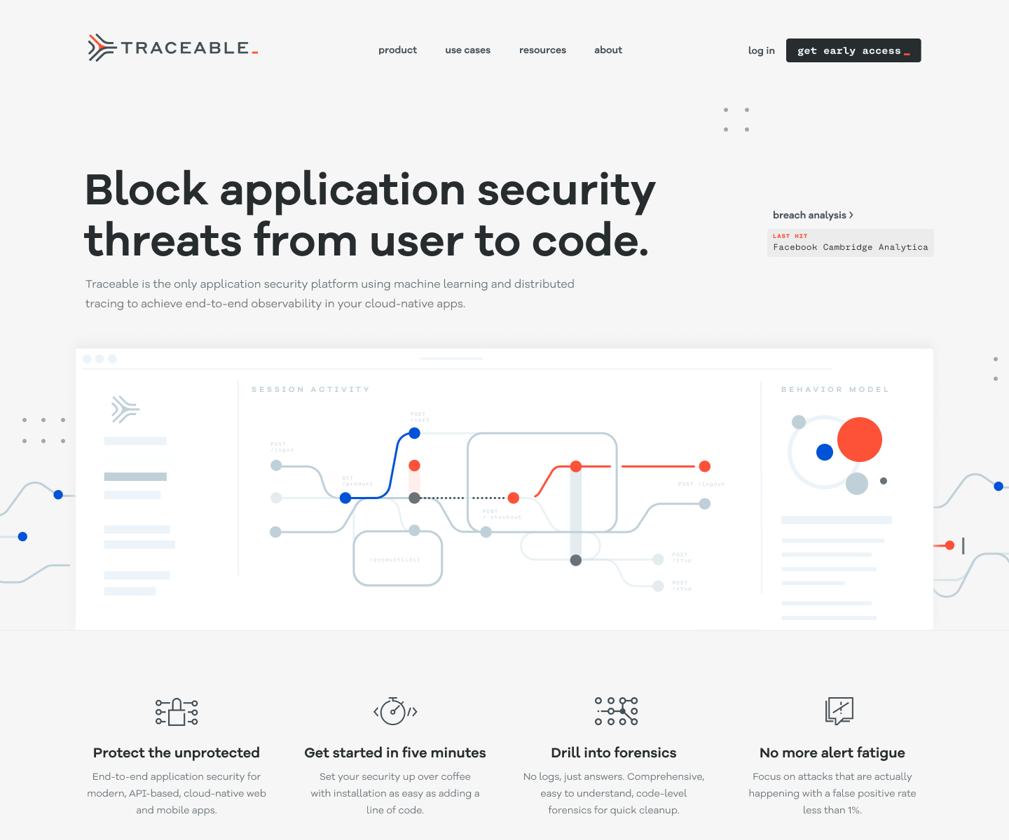
The website had one job: get a skeptical CISO to book a demo. Everything else was secondary.
Enterprise security buyers don't browse. They arrive with a specific question, evaluate the answer in roughly thirty seconds, and either schedule time with the team or leave. The site needed to answer their question immediately and make the next step obvious. That meant ruthless prioritization of the homepage — what stays above the fold, what gets cut, and what earns a deeper page.
Beyond the homepage, I built a content and marketing system that could scale without adding headcount. Webinars, blog posts, event collateral, and social assets all drew from the same visual system.
Templates were built so that marketing could produce on-brand material without a designer in the loop for every execution. That's what design leverage looks like at a startup: building the system once so the team can run without you.
The site also served a second audience alongside CISOs: investors. As we moved toward the Series B, the website was part of the due diligence picture. A polished, coherent web presence at this stage of a company signals operational maturity. Investors notice when a company looks like it has its act together, even if they don't articulate it that way.


Website & Marketing
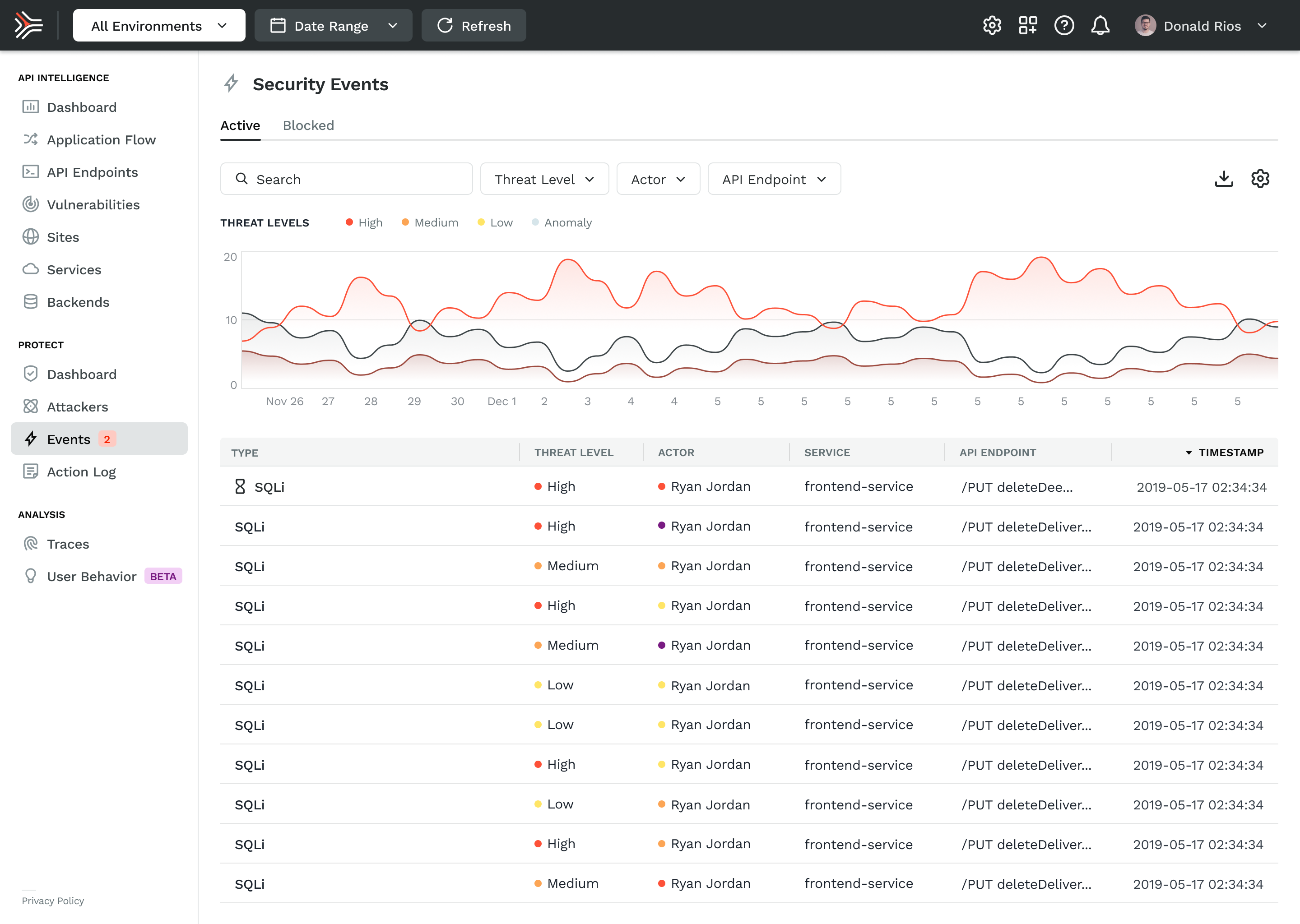
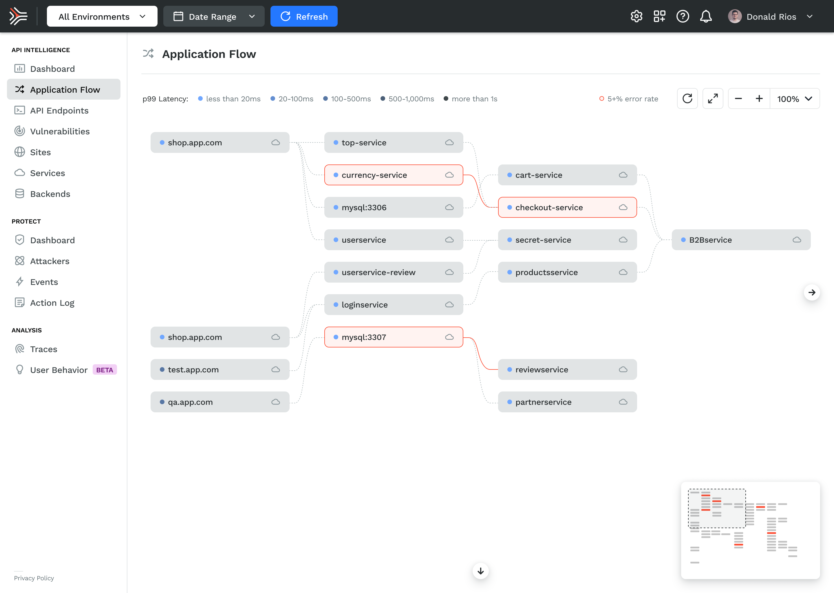
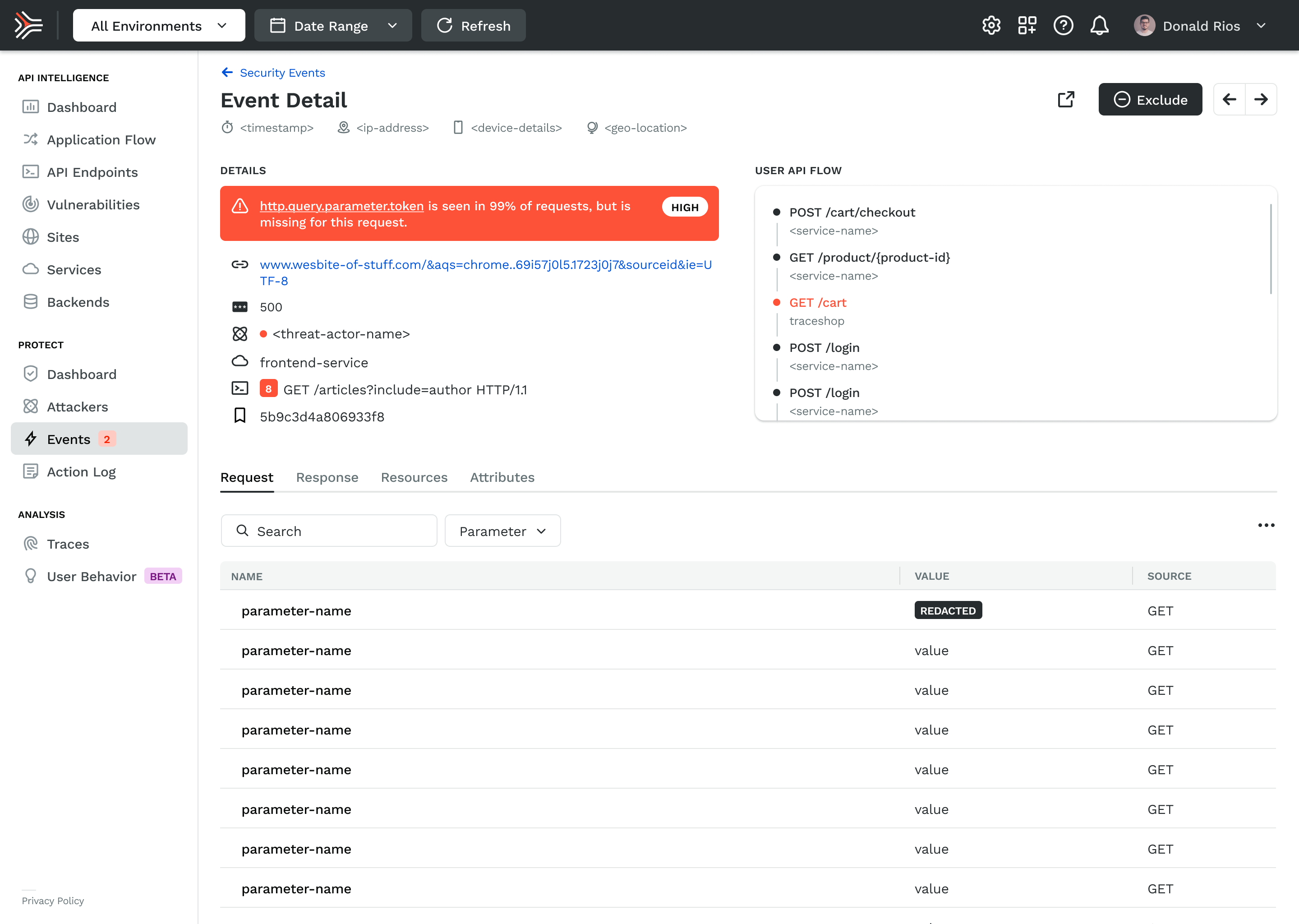
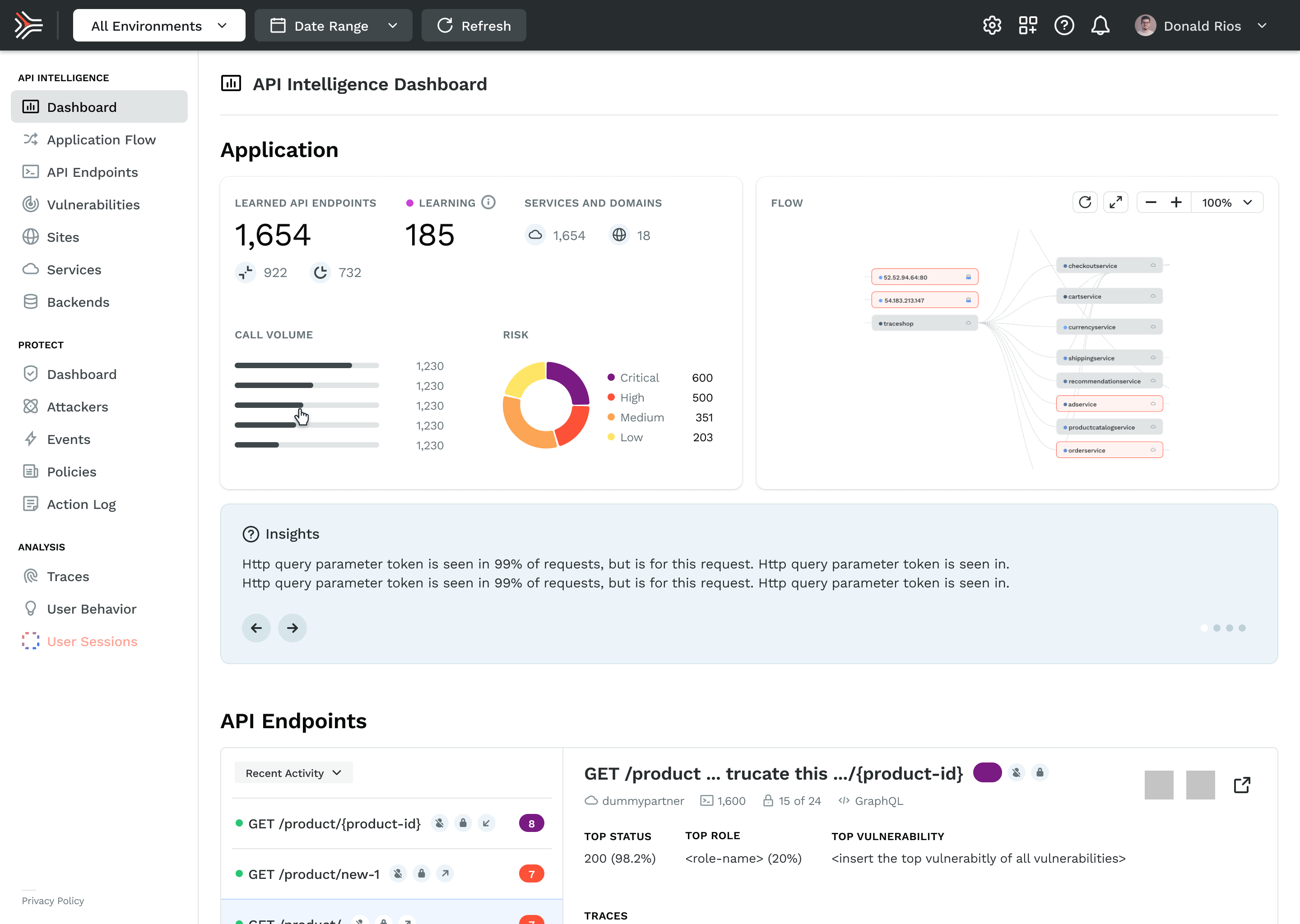
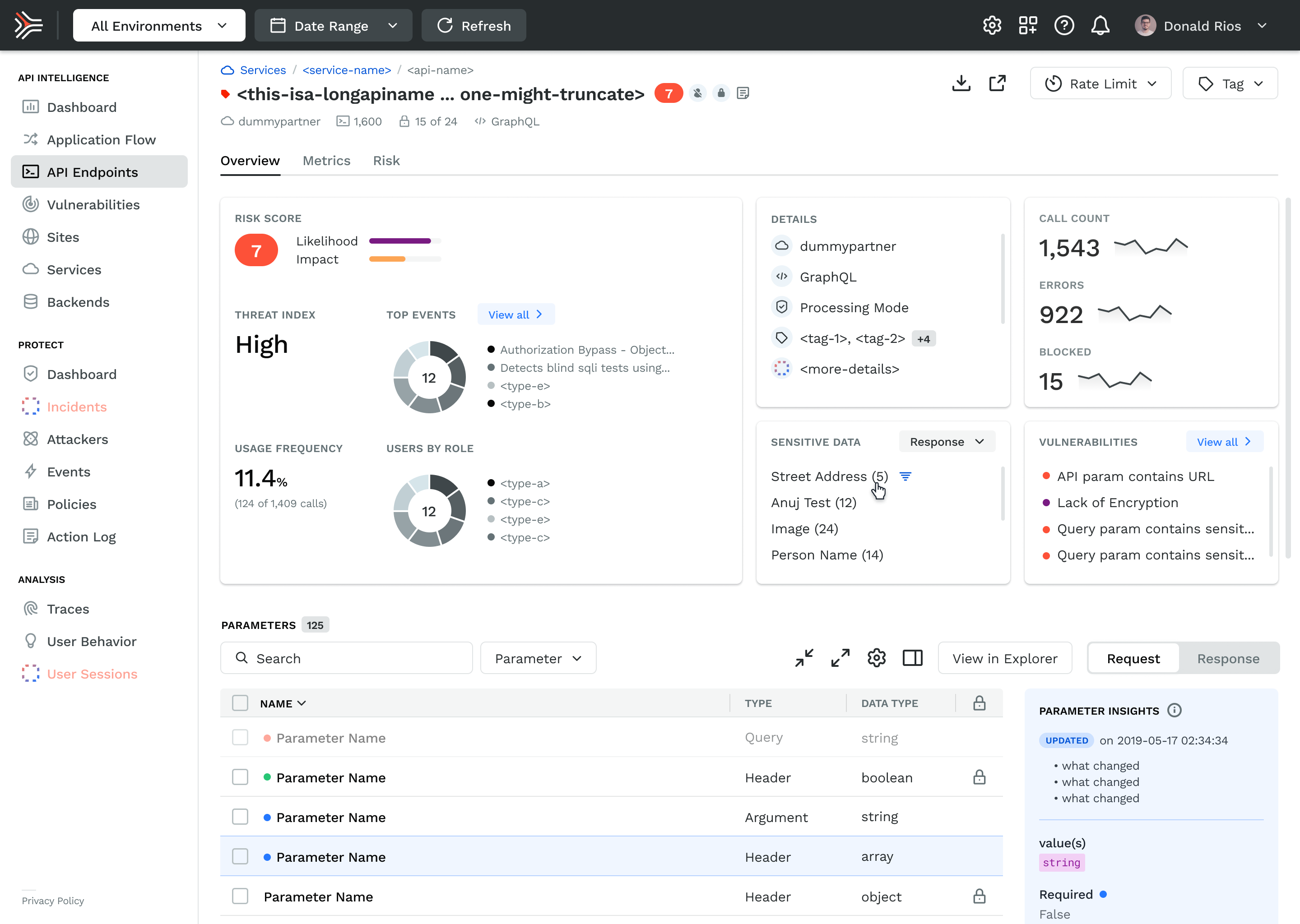
The product had to solve a genuinely hard UX problem: making invisible things visible, fast. APIs don't have a natural visual form. Traffic, risk, and threat data are abstract until something goes wrong, and by then the window to act is already closing. The design challenge was building interfaces that made that data readable at a glance for users who were often responding to incidents under pressure.
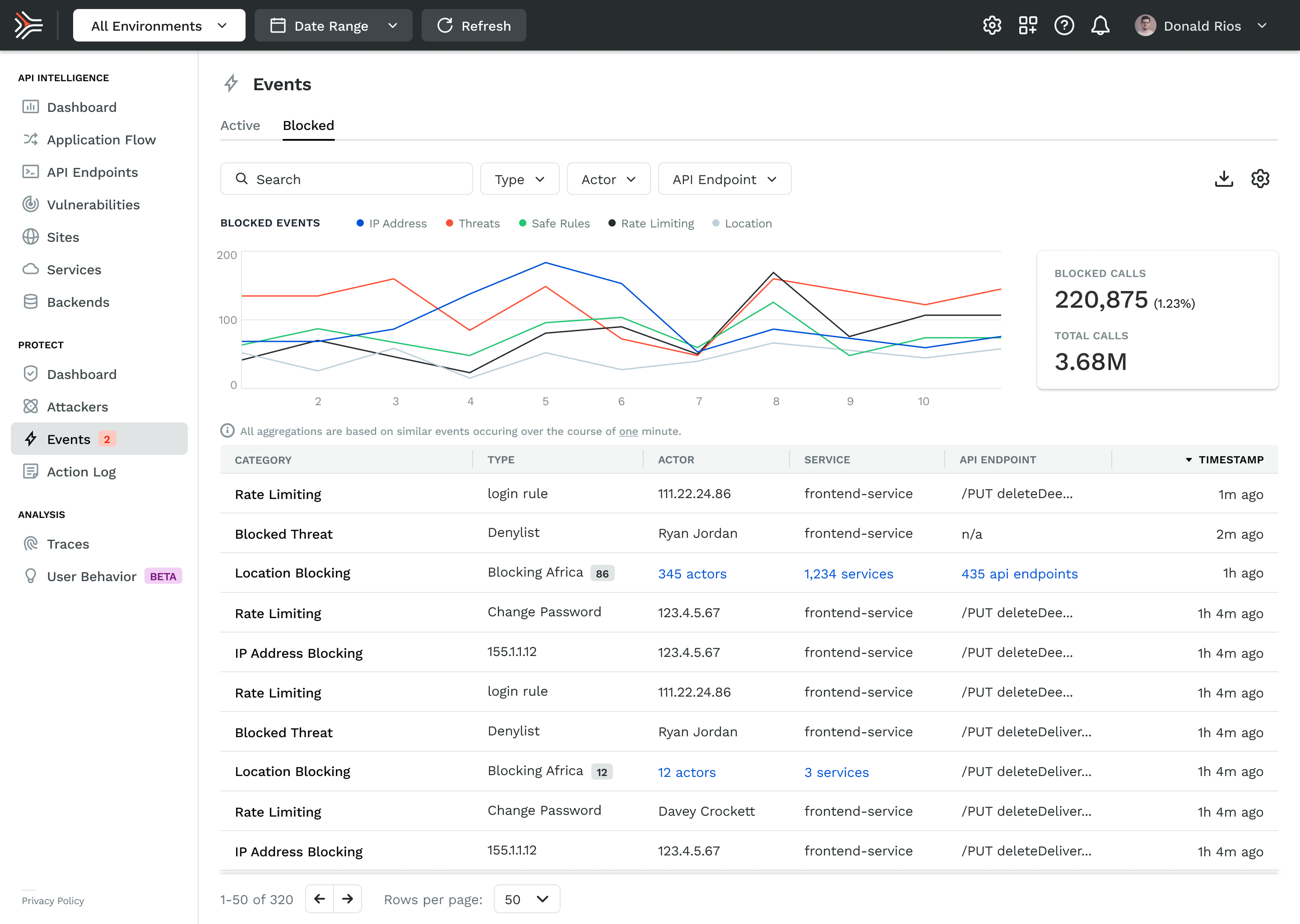
I organized the product around three surfaces that mirrored how a security team actually worked. Observe gave teams situational awareness — a continuous view of application and API behavior at whatever altitude they needed, from a single endpoint to the full environment. Protect made the distinction between active threats and handled ones explicit.
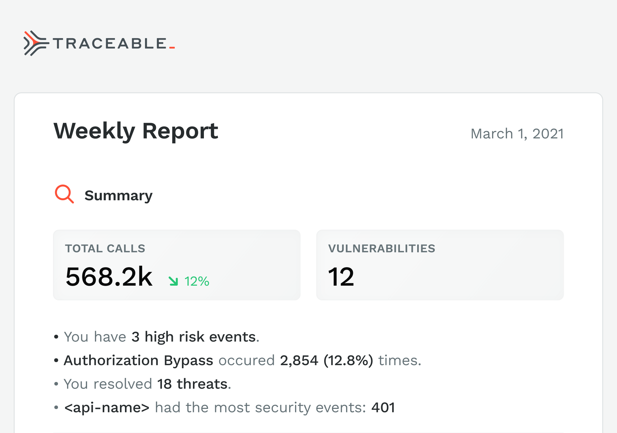
That distinction mattered commercially too: showing what the platform had already blocked was how we demonstrated value in renewal conversations. Risk Assessment gave teams control over how risk was scored, with customizable parameters that reflected the reality that a healthcare company and a crypto exchange have fundamentally different threat priorities.
The hardest design problem across all three surfaces was density. Security teams work with high volumes of data and low tolerance for ambiguity. The temptation in a first product is to show everything. The discipline is knowing what to hide until it's needed. We erred toward clarity, surfacing the signal and pushing the noise into secondary views. That call made the product more usable and, in demos, more legible to buyers who only had thirty minutes to evaluate it.
The Product
The product had to solve a genuinely hard UX problem: making invisible things visible, fast. APIs don't have a natural visual form. Traffic, risk, and threat data are abstract until something goes wrong, and by then the window to act is already closing. The design challenge was building interfaces that made that data readable at a glance for users who were often responding to incidents under pressure.
I organized the product around three surfaces that mirrored how a security team actually worked. Observe gave teams situational awareness — a continuous view of application and API behavior at whatever altitude they needed, from a single endpoint to the full environment. Protect made the distinction between active threats and handled ones explicit. That distinction mattered commercially too: showing what the platform had already blocked was how we demonstrated value in renewal conversations. Risk Assessment gave teams control over how risk was scored, with customizable parameters that reflected the reality that a healthcare company and a crypto exchange have fundamentally different threat priorities.
The hardest design problem across all three surfaces was density. Security teams work with high volumes of data and low tolerance for ambiguity. The temptation in a first product is to show everything. The discipline is knowing what to hide until it's needed. We erred toward clarity, surfacing the signal and pushing the noise into secondary views. That call made the product more usable and, in demos, more legible to buyers who only had thirty minutes to evaluate it.
Let’s get to work
I'm always interested in connecting with fellow leaders, exploring new opportunities, and discussing, well, just about anything.

Get in touch

Michael Spiegel
© 2026 Two Pixels, LLC. All rights reserved.
Home
Work
About
Substack

Home
Work
About
Blog

Get in touch
Traceable AI
Traceable was founded to solve one of enterprise security's hardest problems: APIs were multiplying faster than anyone could monitor them, and attackers knew it before most security teams did. I joined in May 2019 as the first design hire, with no team, no brand, and no system.
Over three years, I built the design function from scratch — brand identity, product design, marketing system, and agency partnerships — and we closed a $60M Series B in May 2022.
ROLE
Design Director
Partner management
TEAM
Founding partners
2 Product designers
1 Agency
CROSS-FUNCTIONAL PARTNERS
CEO, CTO, Head of Engineering, Product, and Marketing
Session Activity


POST /cart
POST / checkout
POST /itup
POST /itup
POST /logout
/product{id1}
GET /product
POST /login
Behavior model
The Founding Context
By 2019, APIs had become the dominant attack surface in enterprise software, and the security industry hadn't caught up. Most tools were built for perimeter defense, not for the kind of distributed, cloud-native traffic that modern applications ran on. Traceable's founders, Jyoti Bansal and Sanjay Nagaraj, had seen this gap up close at their previous company and built Traceable specifically to close it.
The product thesis was sound. The design problem was credibility. Enterprise security buyers, specifically CISOs, are among the most skeptical audiences in technology. They’re accustomed to tools designed by engineers for engineers or ones that simply bypass any type of UI, such as terminal or CLI. This was a common refrain at previous companies such as D2IQ and CircleCI, so I was close to these conversations. They buy on trust, validated by proof. A company with no visual identity, no coherent web presence, and no polished product UI was going to lose deals before the demo started. Design was a sales prerequisite with validation of the efficacy of the tool. Over time, a core group of us were able to demonstrate the product both through monitoring and finding vulnerabilities in their system.
The website came third, because it was a part of our stealth launch and only shared with potential clients internally.. The product design work continued to run in parallel as the engineering team matured, and the marketing system was built to scale content without requiring a bigger team to produce it.
By the time we were closing our Series B and before I left, we had two additional product designers, one agency relationship, and a design system that covered brand, product, and marketing. That output came from three years of deliberate sequencing, creating the business case for more headcount as our product grew.
2019
Apr
Jul
Oct
2020
Apr
Jul
Oct
2021
Apr
Jul
Oct
2022
Signed July 14, 2020
2 Designers
Signed May, 2022
Stealth launch
2.0 Designs
MVP
1.0 Launch
Branding & Identity
Website
Series A
Hiring
Series B
July 14, 2020
July 14, 2020
June 2019
Apr 2020
Jan 2020
July 2020
Planning to ship
To get alignment for the work, I partnered closely with engineering to develop a realistic roadmap. In addition, we created a set of phases and priorities. This roadmap gave us the ammunition to get internal buy-in, solidify the roadmap, and approve additional headcount.
Building the Function
When I joined, the design function was a blank slate. No system, no brand, no process. The question wasn't what to design first. It was what the business needed most to operate credibly in the market.
I sequenced it with a strong design POV, but in collaboration with the CEO and CTO. Initial designs for the core of the product came first. We needed to resolve some foundational issues such as the trace flow, information architecture, and prioritized details. While brand identity was developed in parallel, it was secondary in sequence because the visual language served as the foundation for everything downstream—including the product UI, website, and sales collateral. I prioritized understanding our strategic direction before diving too deep into the UI. Consequently, I architected the entire design system to anticipate these shifts, ensuring a seamless and efficient transition.
The website came third, because it was a part of our stealth launch and only shared with potential clients internally.. The product design work continued to run in parallel as the engineering team matured, and the marketing system was built to scale content without requiring a bigger team to produce it.
By the time we were closing our Series B and before I left, we had two additional product designers, one agency relationship, and a design system that covered brand, product, and marketing. That output came from three years of deliberate sequencing, creating the business case for more headcount as our product grew.
I wrote the creative brief, then ran a competitive pitch process with the CEO and CTO to select the right agency. The brief wasn't about aesthetics. It was about the buyer. Who are we talking to, what do they already believe, and what do we need them to feel in the first ten seconds of contact with this brand. The agency selection came down to which team understood that question most clearly, not which one had the best portfolio.
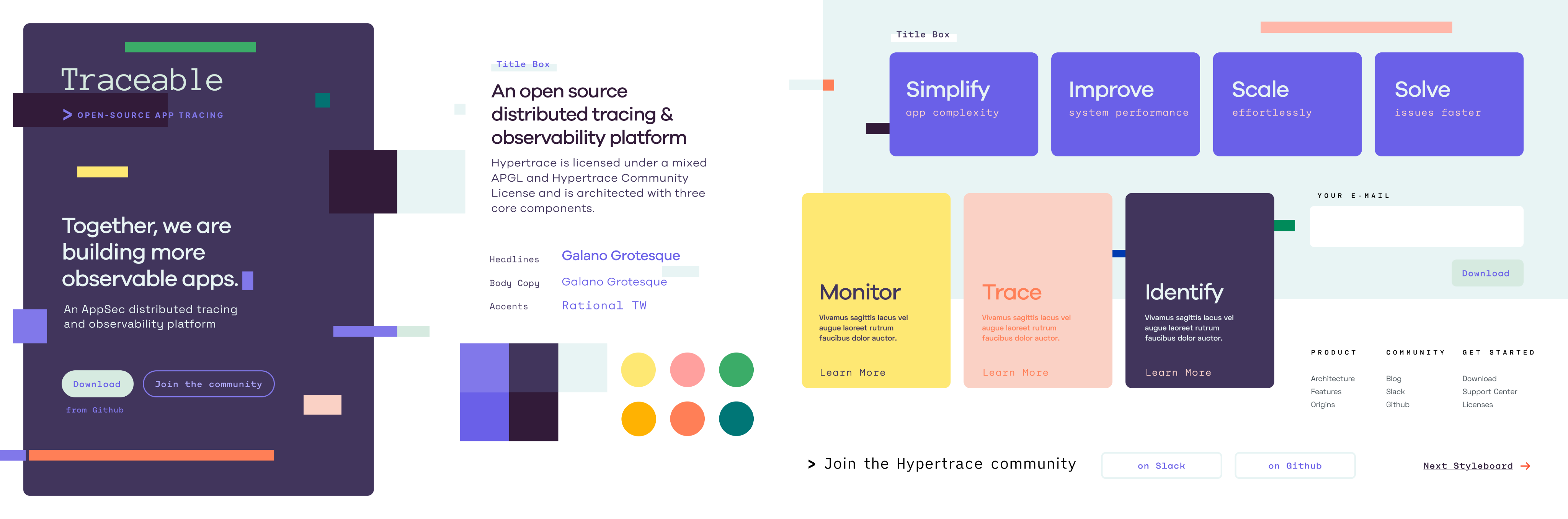
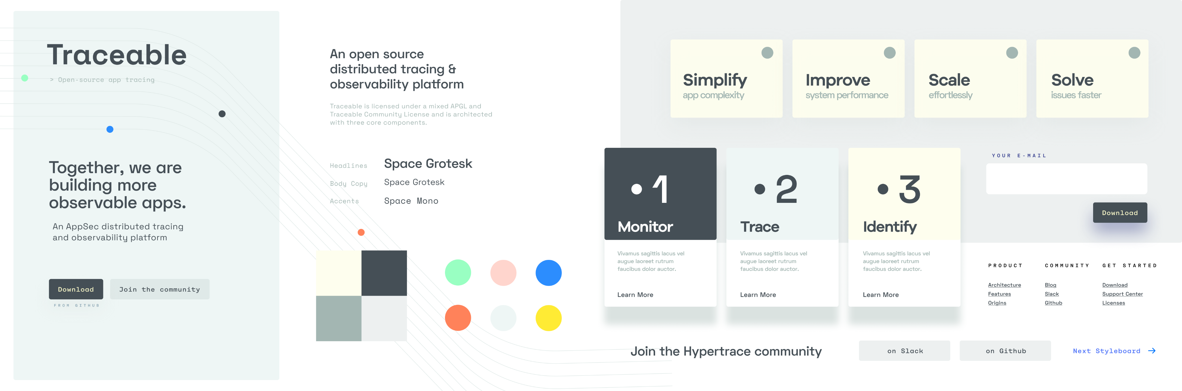
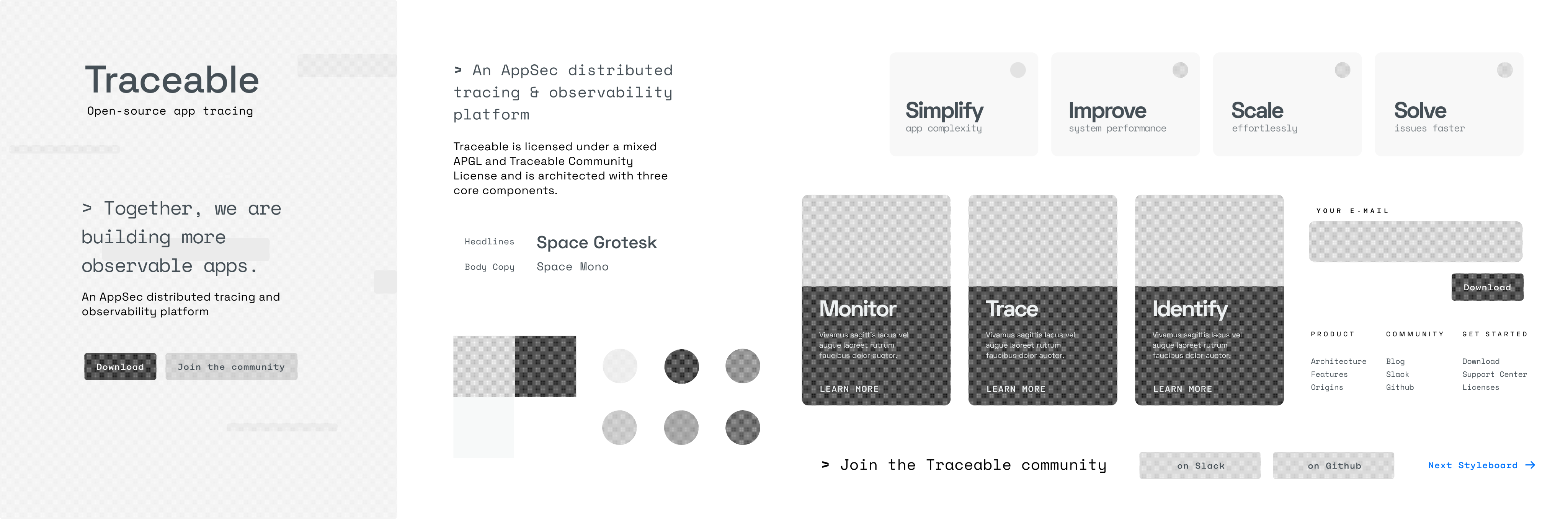
What came out of the process was a visual identity built on clarity and precision. Clean type, a restrained color system, and a mark that worked at every scale from a favicon to a conference backdrop. The design intentionally avoided anything that read as aggressive or theatrical. In a category where fear was the default sales motion, we chose confidence instead.
Brand & Identity
The website had one job: get a skeptical CISO to book a demo. Everything else was secondary.
Enterprise security buyers don't browse. They arrive with a specific question, evaluate the answer in roughly thirty seconds, and either schedule time with the team or leave. The site needed to answer their question immediately and make the next step obvious. That meant ruthless prioritization of the homepage — what stays above the fold, what gets cut, and what earns a deeper page.
Beyond the homepage, I built a content and marketing system that could scale without adding headcount. Webinars, blog posts, event collateral, and social assets all drew from the same visual system.
Templates were built so that marketing could produce on-brand material without a designer in the loop for every execution. That's what design leverage looks like at a startup: building the system once so the team can run without you.
The site also served a second audience alongside CISOs: investors. As we moved toward the Series B, the website was part of the due diligence picture. A polished, coherent web presence at this stage of a company signals operational maturity. Investors notice when a company looks like it has its act together, even if they don't articulate it that way.
Website & Marketing
The product had to solve a genuinely hard UX problem: making invisible things visible, fast. APIs don't have a natural visual form. Traffic, risk, and threat data are abstract until something goes wrong, and by then the window to act is already closing. The design challenge was building interfaces that made that data readable at a glance for users who were often responding to incidents under pressure.
I organized the product around three surfaces that mirrored how a security team actually worked. Observe gave teams situational awareness — a continuous view of application and API behavior at whatever altitude they needed, from a single endpoint to the full environment. Protect made the distinction between active threats and handled ones explicit.
That distinction mattered commercially too: showing what the platform had already blocked was how we demonstrated value in renewal conversations. Risk Assessment gave teams control over how risk was scored, with customizable parameters that reflected the reality that a healthcare company and a crypto exchange have fundamentally different threat priorities.
The hardest design problem across all three surfaces was density. Security teams work with high volumes of data and low tolerance for ambiguity. The temptation in a first product is to show everything. The discipline is knowing what to hide until it's needed. We erred toward clarity, surfacing the signal and pushing the noise into secondary views. That call made the product more usable and, in demos, more legible to buyers who only had thirty minutes to evaluate it.
The Product
The product had to solve a genuinely hard UX problem: making invisible things visible, fast. APIs don't have a natural visual form. Traffic, risk, and threat data are abstract until something goes wrong, and by then the window to act is already closing. The design challenge was building interfaces that made that data readable at a glance for users who were often responding to incidents under pressure.
I organized the product around three surfaces that mirrored how a security team actually worked. Observe gave teams situational awareness — a continuous view of application and API behavior at whatever altitude they needed, from a single endpoint to the full environment. Protect made the distinction between active threats and handled ones explicit. That distinction mattered commercially too: showing what the platform had already blocked was how we demonstrated value in renewal conversations. Risk Assessment gave teams control over how risk was scored, with customizable parameters that reflected the reality that a healthcare company and a crypto exchange have fundamentally different threat priorities.
The hardest design problem across all three surfaces was density. Security teams work with high volumes of data and low tolerance for ambiguity. The temptation in a first product is to show everything. The discipline is knowing what to hide until it's needed. We erred toward clarity, surfacing the signal and pushing the noise into secondary views. That call made the product more usable and, in demos, more legible to buyers who only had thirty minutes to evaluate it.
Let’s get to work
I'm always interested in connecting with fellow leaders, exploring new opportunities, and discussing, well, just about anything.
Get in touch
Michael Spiegel
© 2026 Two Pixels, LLC. All rights reserved.
Home
Work
About
Substack
Home
Work
About
Blog
Get in touch
Traceable
Traceable was founded to solve one of enterprise security's hardest problems: APIs were multiplying faster than anyone could monitor them, and attackers knew it before most security teams did. I joined in May 2019 as the first design hire, with no team, no brand, and no system.
In two and a half years, I built the design function from scratch — brand identity, product design, marketing system, and agency partnerships — and we closed a $60M Series B in May 2022.

Session Activity


POST /cart
POST / checkout
POST /itup
POST /itup
POST /logout
/product{id1}
GET /product
POST /login
Behavior model
ROLE
Design Director
Partner management
TEAM
Founding partners
2 Product designers
1 Agency
CROSS-FUNCTIONAL PARTNERS
CEO, CTO, Head of Engineering, Product, and Marketing
The Founding Context
By 2019, APIs had become the dominant attack surface in enterprise software, and the security industry hadn't caught up. Most tools were built for perimeter defense, not for the kind of distributed, cloud-native traffic that modern applications ran on. Traceable's founders, Jyoti Bansal and Sanjay Nagaraj, had seen this gap up close at their previous company and built Traceable specifically to close it.
The product thesis was sound. The design problem was credibility and trust. Enterprise security buyers, specifically CISOs, are among the most skeptical audiences in technology. They’re accustomed to tools designed by engineers for engineers or ones that simply bypass any type of UI, such as terminal or CLI. This was a familiar refrain at previous companies such as D2IQ and CircleCI.
They buy on trust, validated by proof. A company with no visual identity, no coherent web presence, and no polished product UI was going to lose deals before the demo started. Design was a sales prerequisite with validation of the efficacy of the tool. Over time, a core group of us were able to demonstrate the product through accurate monitoring and surfacing vulnerabilities in their system, by hacking it.
Vulnerable APIs
On average, enterprises manage over 600 API endpoints, with 84% experiencing API security incidents in the past year. Research shows that 3.4% of an organization’s active APIs are completely unauthenticated, and 95% of API attacks come from authenticated, but malicious, sessions. The numbers are staggering:
- Over 20% of total API inventory consists of "shadow APIs"—undocumented, forgotten, or unmanaged endpoints.
- Organizations with public APIs face an average of 10,000 attacks per day.
- 81% of organizations knowingly ship code with vulnerabilities, with 98% experiencing a breach stemming from this in the past year.
- The average API breach leads to at least 10 times more data leakage than a typical security breach.

User Activity
User Activity
API Request
12.123.232
12.256.531
12.123.232
API Request
User Activity
12.254.291
09.123.445
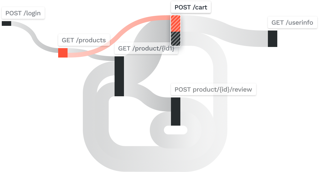
Attackers appear as normal tracker

Then they access the business logic exposed in APIs

Traditional product protected by firewalls an internal systems. Modern product API sprawl with unknown connections and out of date vulnerable code
Building the Function
When I joined, the design function was a blank slate. No system, no brand, no process. The question wasn't what to design first. It was what the business needed most to operate credibly in the market.
I sequenced it with a strong design POV, but in collaboration with the CEO and CTO. Initial designs for the core of the product came first. We needed to resolve some foundational issues such as the trace flow, information architecture, and prioritized details.
While brand identity was developed in parallel, it was secondary. We could architect the product and update the visual language of the product later. Therefore, I prioritized understanding our strategic direction and dove deep into the user experience. In addition, I built the entire product and design system to anticipate these shifts, ensuring a seamless and efficient transition.
The website came third, because it was a part of our stealth launch. It was only shared with potential clients internally. The product design work continued to run in parallel as the engineering team matured, and the web and marketing was built to scale content without requiring a bigger team to produce it.
By the time we were closing our Series B and before I left, we had two additional product designers, one agency relationship, and a design system that covered brand, product, and marketing. That output came from three years of deliberate sequencing, creating the business case for more headcount as our product grew.
2019
Apr
Jul
Oct
2020
Apr
Jul
Oct
2021
Apr
Jul
Oct
2022
Signed July 14, 2020
2 Designers
Signed May, 2022
Stealth launch
2.0 Designs
MVP
1.0 Launch
Branding & Identity
Website
Series A
Hiring
Series B
July 14, 2020
July 14, 2020
June 2019
Apr 2020
Jan 2020
July 2020

Brand & Identity
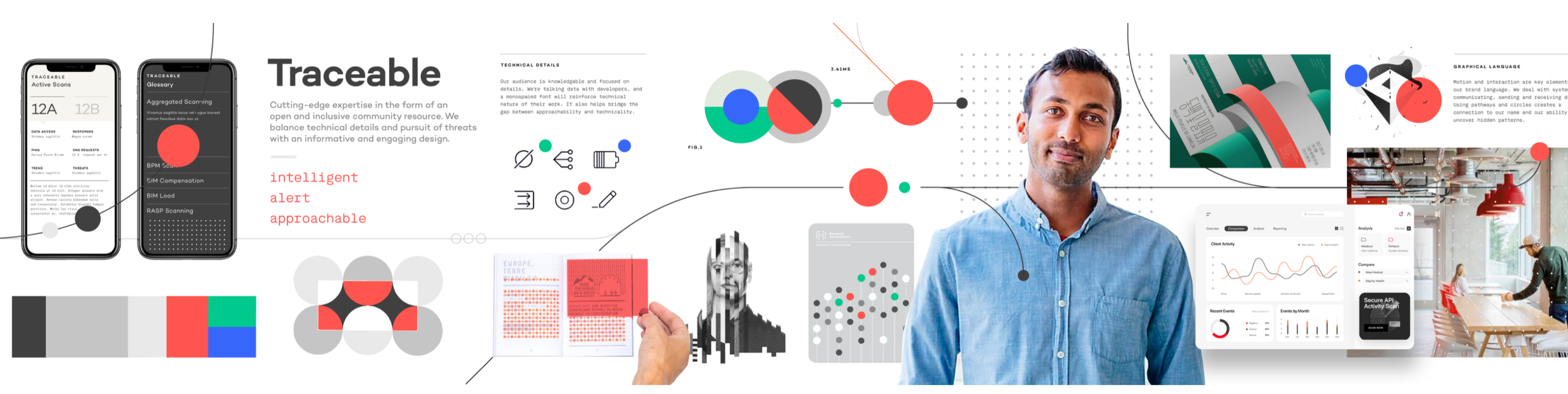
The cybersecurity industry had a default aesthetic: dark backgrounds, aggressive type, neon accents, visual language borrowed from threat intelligence dashboards and hacker films. It communicated power, but it also communicated sameness. Every competitor looked like a variant of the same company.
We made a deliberate choice to go the other direction. Traceable needed to feel modern, precise, and trustworthy — closer to the design language of a sophisticated data platform than a traditional security vendor. The identity had to work for a CISO sitting in a board meeting and a security engineer evaluating the product on a trial. Those are different contexts with different needs, and the brand had to hold up in both.
I wrote the creative brief, then ran a competitive pitch process with the CEO and CTO to select the right agency. The brief wasn't about aesthetics. It was about the buyer. Who are we talking to, what do they already believe, and what do we need them to feel in the first ten seconds of contact with this brand. The agency selection came down to which team understood that question most clearly, not which one had the best portfolio.
What came out of the process was a visual identity built on clarity and precision. Clean type, a restrained color system, and a mark that worked at every scale from a favicon to a conference backdrop. The design intentionally avoided anything that read as aggressive or theatrical. In a category where fear was the default sales motion, we chose confidence instead.
Concepts that didn’t make the cut
What didn’t make the cut? As noted before, we made a conscious decision to go lighter at launch, but we wanted something that could translate well into a dark mode.
The three options to the right failed to meet the mark in a number of ways:
- The top was very bright, but didn’t it lend itself to highlight critical issues. There was concern it looked like more of a consumer product vs B2B enterprise.
- The middle design lacked contrast. However, we found highlights in the lightness with the strokes and flow of the design.
- The bottom design was very on trend with the stroked illustrations, and futuristic fonts. It lacked intensity and didn’t evoke enough severity to the degree we felt our product surfaced. Some stroked illustrations came over, but only as supportive elements.
Website & Marketing
The website had one job: get a skeptical CISO to book a demo. Everything else was secondary.
Enterprise security buyers don't browse. They arrive with a specific question, evaluate the answer in roughly thirty seconds, and either schedule time with the team or leave. The site needed to answer their question immediately and make the next step obvious. That meant ruthless prioritization of the homepage — what stays above the fold, what gets cut, and what earns a deeper page.
Beyond the homepage, I built a content and marketing system that could scale without adding headcount. Webinars, blog posts, event collateral, and social assets all drew from the same visual system.
Templates were built so that marketing could produce on-brand material without a designer in the loop for every execution. That's what design leverage looks like at a startup: building the system once so the team can run without you.
The site also served a second audience alongside CISOs: investors. As we moved toward the Series B, the website was part of the due diligence picture. A polished, coherent web presence at this stage of a company signals operational maturity. Investors notice when a company looks like it has its act together, even if they don't articulate it that way.
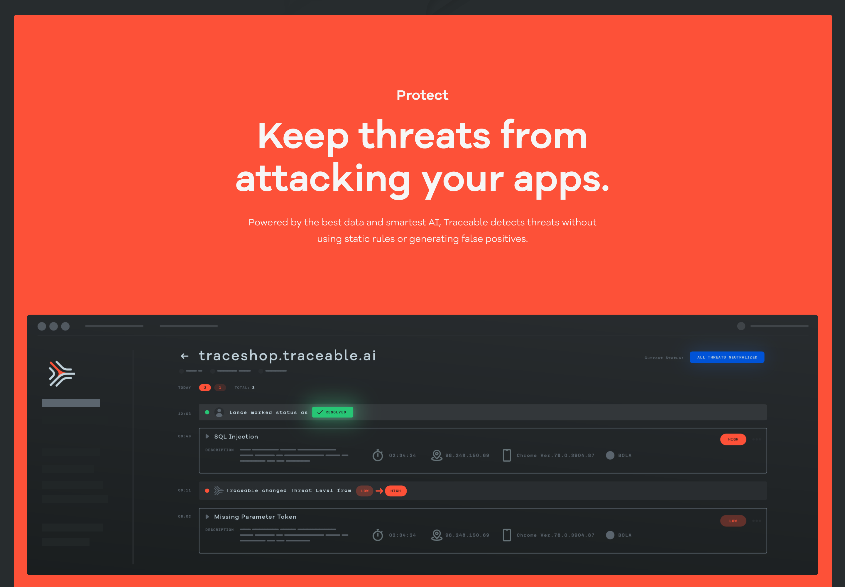
The Product
The product had to solve a genuinely hard UX problem: making invisible things visible, fast. APIs don't have a natural visual form. Traffic, risk, and threat data are abstract until something goes wrong, and by then the window to act is already closing. The design challenge was building interfaces that made that data readable at a glance for users who were often responding to incidents under pressure.
I organized the product around three surfaces that mirrored how a security team actually worked. Observe gave teams situational awareness — a continuous view of application and API behavior at whatever altitude they needed, from a single endpoint to the full environment. Protect made the distinction between active threats and handled ones explicit.
That distinction mattered commercially too: showing what the platform had already blocked was how we demonstrated value in renewal conversations. Risk Assessment gave teams control over how risk was scored, with customizable parameters that reflected the reality that a healthcare company and a crypto exchange have fundamentally different threat priorities.
The hardest design problem across all three surfaces was density. Security teams work with high volumes of data and low tolerance for ambiguity. The temptation in a first product is to show everything. The discipline is knowing what to hide until it's needed. We erred toward clarity, surfacing the signal and pushing the noise into secondary views. That call made the product more usable and, in demos, more legible to buyers who only had thirty minutes to evaluate it.
Outcomes
In May 2022, Traceable closed a $60M Series B. The round was led by Institutional Venture Partners (IVP), and other investors include Tiger Global Management and existing investors Unusual Ventures and BIG Labs with participation from existing investors. The announcement cited the company's proven technology, platform maturity, and growing enterprise customer base.
Three years earlier, there was no brand, no product UI, and no design team. By the time the round closed, we had a visual identity that differentiated in a crowded category, a website built to convert skeptical enterprise buyers, a product used by customers including Bullish, Informatica, and DigitalOcean.
The design function went from one person sequencing foundational work alone to a team with established systems, agency partnerships, and a product design practice integrated into the engineering cycle. From zero to $60M Series B in less than three years.
Let’s get to work
I'm always interested in connecting with fellow leaders, exploring new opportunities, and discussing, well, just about anything.
Get in touch
Michael Spiegel
© 2026 Two Pixels, LLC. All rights reserved.
Home
Work
About
Substack
Home
Work
About
Blog
Get in touch